Noodle Doodle
Logo / Branding / Packaging
Noodle Doodle is a modern noodle brand looking to break the clutter with a playful yet premium identity. I was tasked with designing the Logo, establishing a Brand Language, and creating Packaging that reflects their fun personality using a black & white (dark theme).
The goal: Create a bold, minimalist brand presence that visually pops, especially in urban retail shelves, while retaining a quirky edge through doodle-style elements.
Process
1. Research & Insight Gathering
Studied competitor packaging in urban noodle categories.
Analyzed consumer trends leaning towards clean, contrast-heavy branding.
Mapped emotional goals: playful + premium + memorable.
2. Concept Development
Explored doodle-based motifs and handwritten typefaces.
Chose black & white to reflect confidence, clarity, and shelf contrast.
3. Logo & Brand Design
Created a hand-drawn logotype blended with geometric forms.
Developed supporting visual elements: icons, doodles, typographic hierarchy.
Designed a flexible B/W system for high adaptability across mediums.
4. Packaging Design
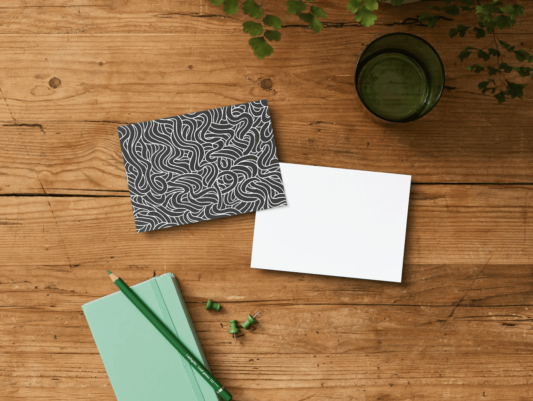
Designed matte black packs with white sketch-style illustrations.
Used grid-based layout for clarity and scalability.
Added interactive touchpoints via QR for product engagement.
5. Testing & Refinement
Tested packaging mockups in real-world environments.
Refined contrast, text legibility, and visual weight.
Discovery & Research
Conducted competitive analysis of modern noodle brands.
Identified user preference for minimalist, premium aesthetics in food packaging.
Defined brand keywords: Playful, Urban, Bold.

Visual Direction
Explored visual styles inspired by street art and bold sketch lines to reflect the “Doodle” in Noodle Doodle.
Logo & Branding System
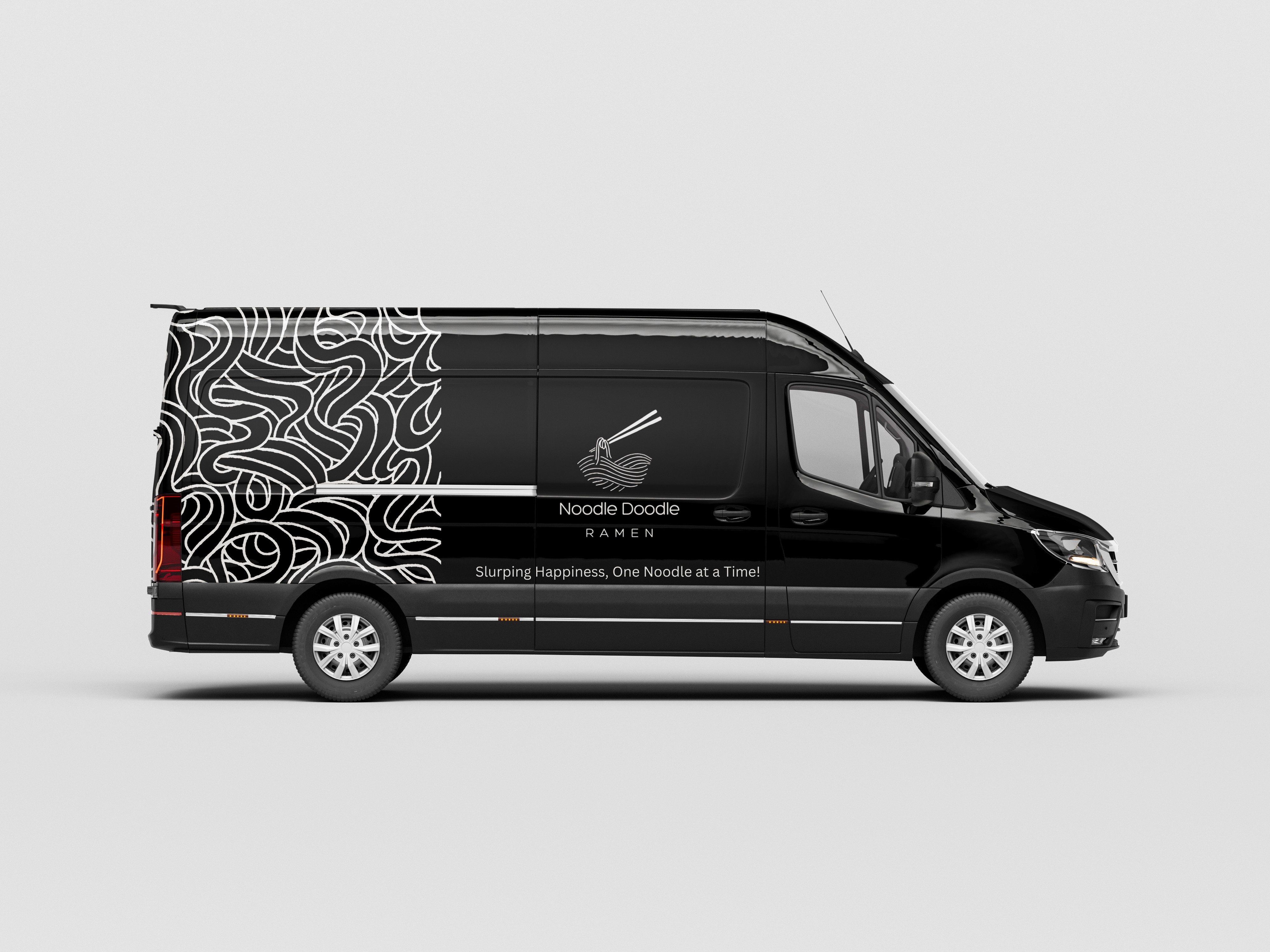
Designed a black-and-white logo combining handwritten curves and sharp modern type to create an expressive, high-contrast identity.
The dark theme symbolizes urban minimalism, allowing the product’s vibrant noodles to stand out in contrast on shelves.
B/W palette ensures brand visibility across digital and physical touchpoints, supporting both economy and impact in print.
Packaging Design
Implemented a playful grid of noodle illustrations in white over matte black backgrounds.
Focused on clear typography and intuitive hierarchy for product variants and ingredients.
Designed sustainable packaging with QR codes for interactive doodle-based content.

Outcome
Delivered a unified visual identity that's bold, memorable, and instantly shelf-ready.
Successfully captured the quirky personality of Noodle Doodle with a sleek, modern twist.